The cheapest support call is the one nobody has to make
In 2013 I designed NetBank's logon retrieval experience. It was meant to last about six months. It ran until 2026.
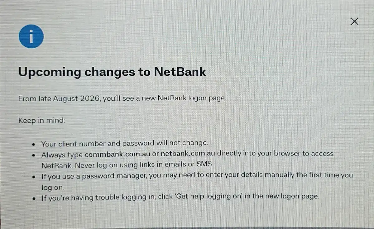
On 2026-08-28 I went to log on to NetBank and a notice appeared. From late August 2026 there is a new logon page, part of a rebuilt NetBank rolling out to customers in stages.
I sat with that for a moment, because I designed the experience it replaces. That was thirteen years ago.
The brief was a cost problem, not a design problem
I was a senior user experience designer at Commonwealth Bank, and this work arrived attached to a number rather than an aesthetic.
The bank was carrying a significant volume of contact centre calls from one narrow set of moments: customers who could not get into NetBank. Forgotten client number. Forgotten password. Locked out and unsure which of the two was actually the problem. Each call is small. At the scale of a retail bank they added up to millions of dollars a year in support cost, and that figure was the reason the project existed.
Nobody asked for a prettier screen. They asked for fewer phone calls. Which meant the experience had to answer a customer’s questions before it occurred to them to ring anyone.
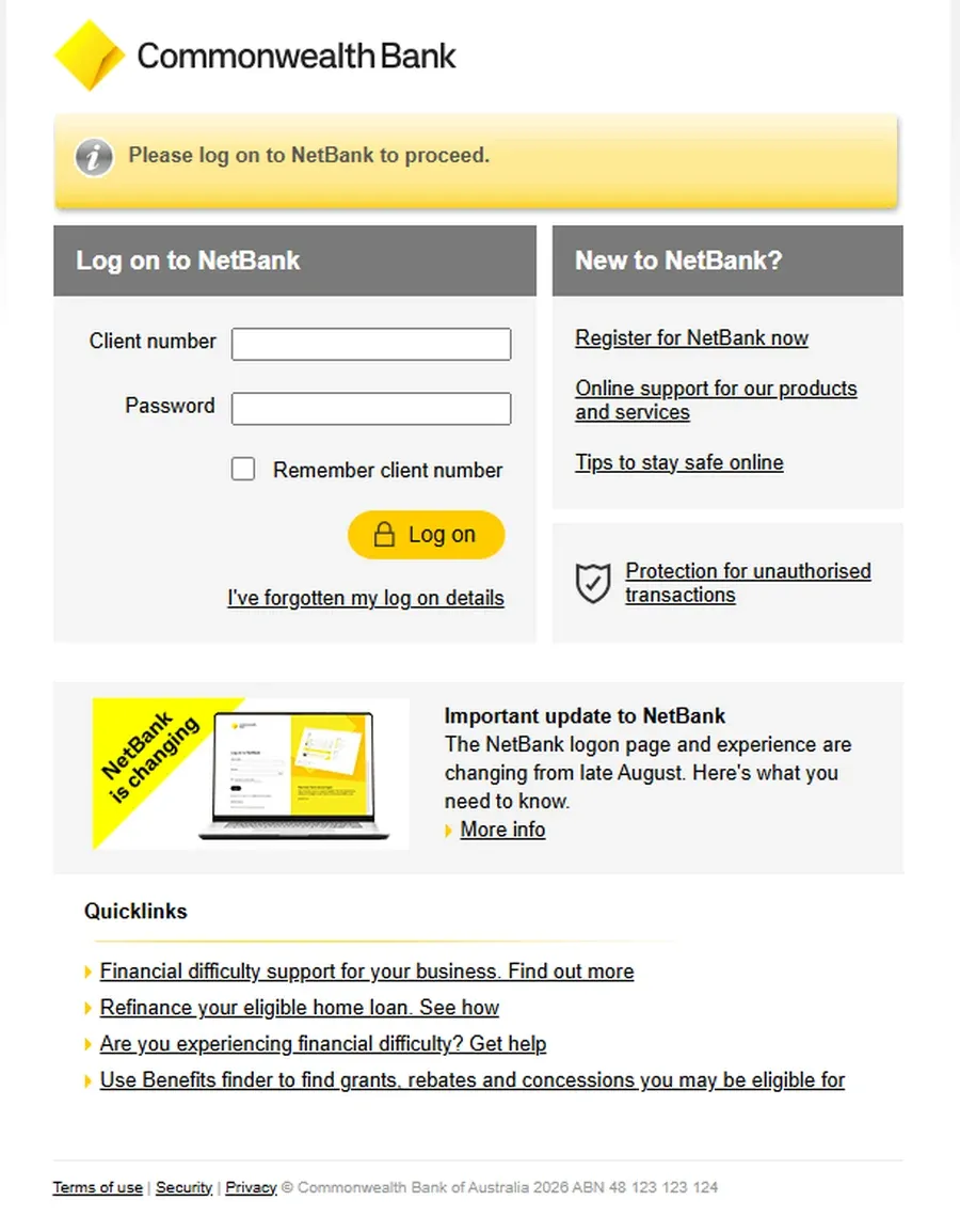
The real work was not the front door
People assume the logon page is the design problem. Two fields and a button. It is the visible part, but almost nobody rings a call centre because a logon page confused them. They ring because they could not get in and could not work out how to fix it themselves.
So the substance of the work was the retrieval journey: the path from "I am locked out" back to "I am in", without a human on the other end of a phone.
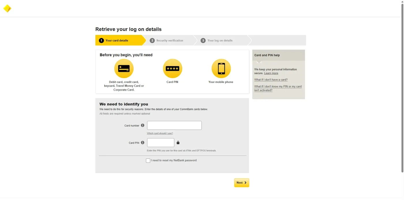
Several decisions in it are worth spelling out, because each one maps to a category of call we were trying to remove.
Tell people what they need before they start
The flow opened with a short panel listing the three things required to complete it: a CommBank card, the card PIN, and a mobile phone. That panel exists because of a specific and expensive failure. Someone begins the process, invests two minutes, hits a verification step they cannot pass because their phone is in another room or they are not sure which card to use, gives up, and rings the contact centre from a worse mood than they started in. A pre-flight checklist costs one screen of attention and prevents a whole class of abandonment.
Show the shape of the journey
A three-step indicator across the top: card details, security verification, log on details. When people can see that a process is finite and where they are inside it, they are markedly more willing to continue. Uncertainty about length is one of the quiet drivers of abandonment.
Verify with something people still have
Identity was established with a card number and card PIN. That is deliberate. The customer arriving at this screen has, by definition, forgotten a credential. Asking them for another one they might not remember is how you build a loop instead of a path. Card and PIN are in their wallet and in their muscle memory.
Answer the edge cases in place
Beside the form sat the questions that actually generate calls. Which card should I use? What if I do not have a card? What if I do not know my PIN, or my card is not activated? Those answers were on the screen, at the moment the question arises, not filed on a separate help page the customer would have to go looking for. Contextual help is not decoration. Every one of those links is a call that does not get made.
Do not make the customer diagnose their own problem first
The single most useful decision in the whole flow was a checkbox: I need to reset my NetBank password. Retrieval and reset are two different journeys in the bank’s mind. They are one situation in the customer’s mind, and it usually sounds like "I cannot get in and I am not sure what I have lost". Forcing a person to correctly categorise their own failure before they can start fixing it produces wrong turns, and wrong turns produce phone calls. Merging the two paths and letting the customer opt into the second removed that fork entirely.
None of this is glamorous. All of it is research, information architecture and copy, settled well before anyone opens a visual design tool. I had a visual designer assigned to bring the polish once the structure held, which is the right order to work in.
"Temporary" is a hypothesis, not a fact
Here is the part that makes the story worth telling.
While we were doing this, the bank had a separate programme underway to rebuild the public marketing site. The agency on that work was also expected to produce new designs for the logon and password reset screens so everything matched the new brand. Which meant the experience I was building was, by common agreement, interim. Months, not years.
That created a reasonable argument I found myself on the wrong side of. If a thing is about to be replaced, why invest in it? Ship something serviceable and move on. It is a defensible position, and design leadership is largely the business of deciding where not to spend effort. On most days that call is correct.
I took the other view. The experience was going live to millions of customers in the meantime, the support cost was accruing in the meantime, and I did not think "it is temporary" justified guessing at answers we could go and find.
There was real disagreement about that, and some of it was robust. Both positions were held in good faith. One of them was about protecting the team’s time for work that would last, the other was about not shortchanging customers who would be using this thing on Monday morning. Those are the same argument viewed from two different distances, and most product teams are having some version of it right now.
What broke the deadlock was not persuasion, it was evidence, and the resourcing problem underneath is worth extracting because it is universal. Interim work does not get its own research budget. So we did not ask for one. We attached questions about the retrieval flow to usability sessions already scheduled for other projects and collected findings alongside everything else being tested. It cost almost nothing. It also meant the conversation stopped being about how much time the screens deserved and started being about what customers were actually doing on them, which is a much easier conversation to resolve.
A constraint on budget is rarely a constraint on evidence. It is usually just a constraint on convenience.
Several website rebuilds. A mobile app that became the primary channel. A brand refresh. The recovery journey stayed where it was.
Thirteen years
The new marketing site launched. I went and looked. The logon and retrieval experience was unchanged.
It stayed unchanged. The bank has been through several iterations of its website since. NetBank itself has changed considerably. The CommBank app became the primary channel for most customers. And that flow kept doing its job, from 2013 until 2026. Something scoped for six months ran for thirteen years.
I want to be honest about why, because there is a version of this story where I take full credit and it would not be true. Large banks do not leave authentication journeys alone purely out of admiration. Legacy platform constraints, competing priorities, and the risk and cost of changing the front door for millions of customers are all part of the explanation. Inertia is real.
But inertia only protects something that works. A retrieval flow generating cost and complaints does not survive thirteen roadmaps. It gets escalated.
What changed in 2026, and what did not
The new NetBank is a genuine rebuild and it looks good. Cleaner logon, restructured navigation, a trusted browser option for faster repeat logons.
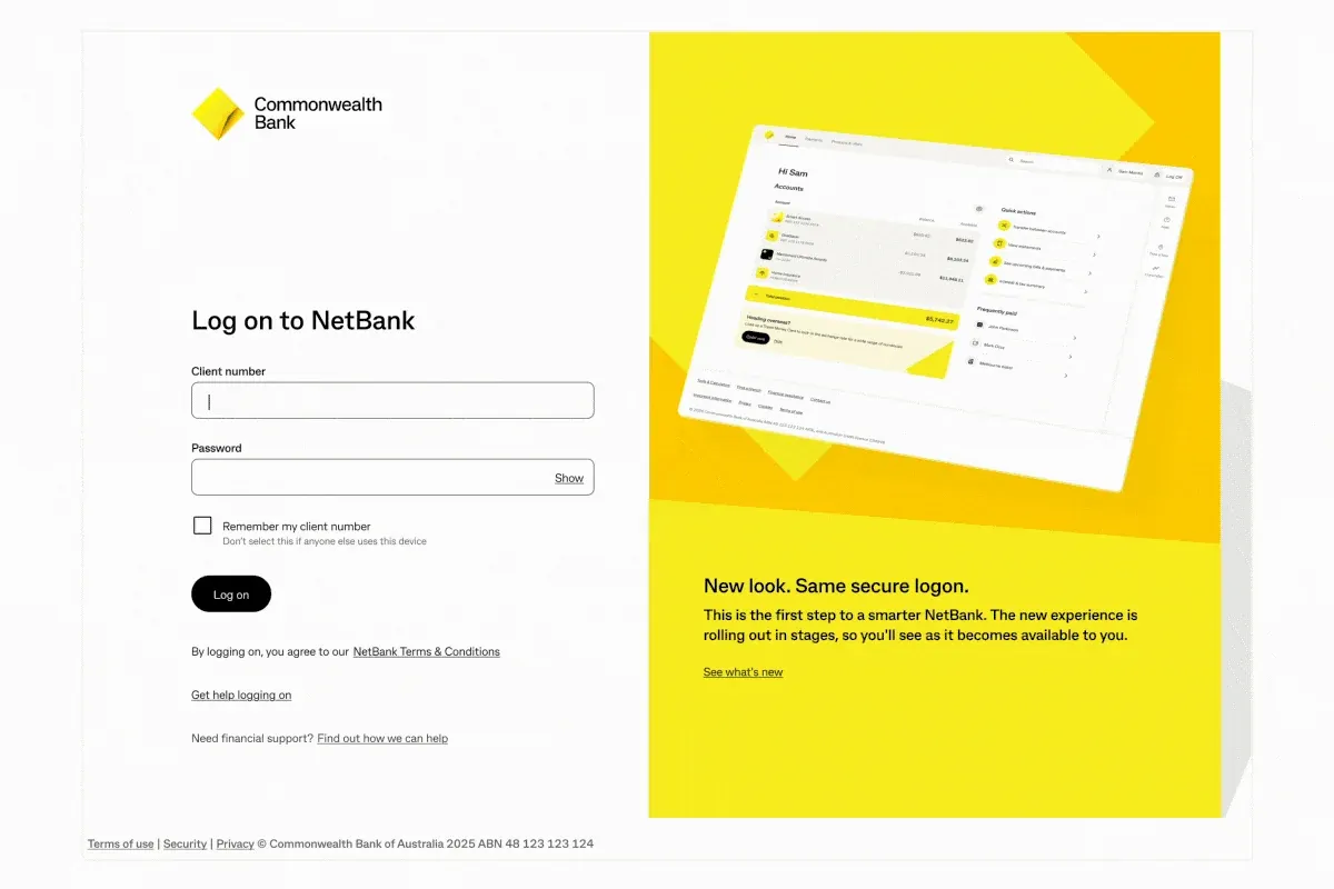
Look at what has been kept, though. The same client number and password. The same saved details and payees. And on the new logon page, sitting where it has always sat, a visible doorway for people who cannot get in: Get help logging on, leading to a path for finding your client number.
The surface changed. The model did not.
That is the real argument for doing this work properly, and it is a better one than any claim about longevity. Sound structure gets restyled. Unsound structure gets rebuilt, and rebuilding the way millions of people recover access to their bank is expensive in a way that redrawing it is not.
Six reasons to do it properly, every time
- Interfaces outlive the plans made for them. Roadmaps slip, budgets move, priorities change. The interim thing ships and then simply sits there, being used. Assume what you build will still be in production long after the plan that justified it is forgotten.
- Failure states are where the money is. Teams instinctively polish the happy path, because that is what gets demonstrated. Support cost is generated almost entirely by the unhappy one. The lost, locked out and confused are the customers whose experience shows up on the P&L.
- Support volume is the honest scoreboard. You do not need a survey to know whether an experience explains itself. Count the calls. Design that reduces them is not a soft benefit, it is a line item, and framing it that way is how the work gets funded.
- Doing it once is cheaper than doing it twice. The fortnight saved at design time is repaid later with interest, in rework, retraining, rewritten help content and the cost of re-educating customers who had already learned the old thing.
- Structure is the durable asset. Visual language dates in about five years. Information architecture, labelling and recovery paths, done well, last far longer. Invest accordingly.
- Trust lives at the front door. People decide whether they feel safe at the moment they hand over credentials. Familiarity and consistency there are protective, which is exactly why banks warn customers about impersonation scams whenever a logon experience changes.
The part I keep coming back to
The best outcome for a piece of design work is often that nothing happens. No escalation, no complaint spike, no urgent remediation project. Just a flow that quietly returns people to their banking, for years longer than anyone expected it to.
That is a difficult thing to put on a slide. It is still the whole job.
So if you are shipping something this quarter that everyone agrees is temporary, it is worth asking one question before deciding how much care it deserves. What if it is not?